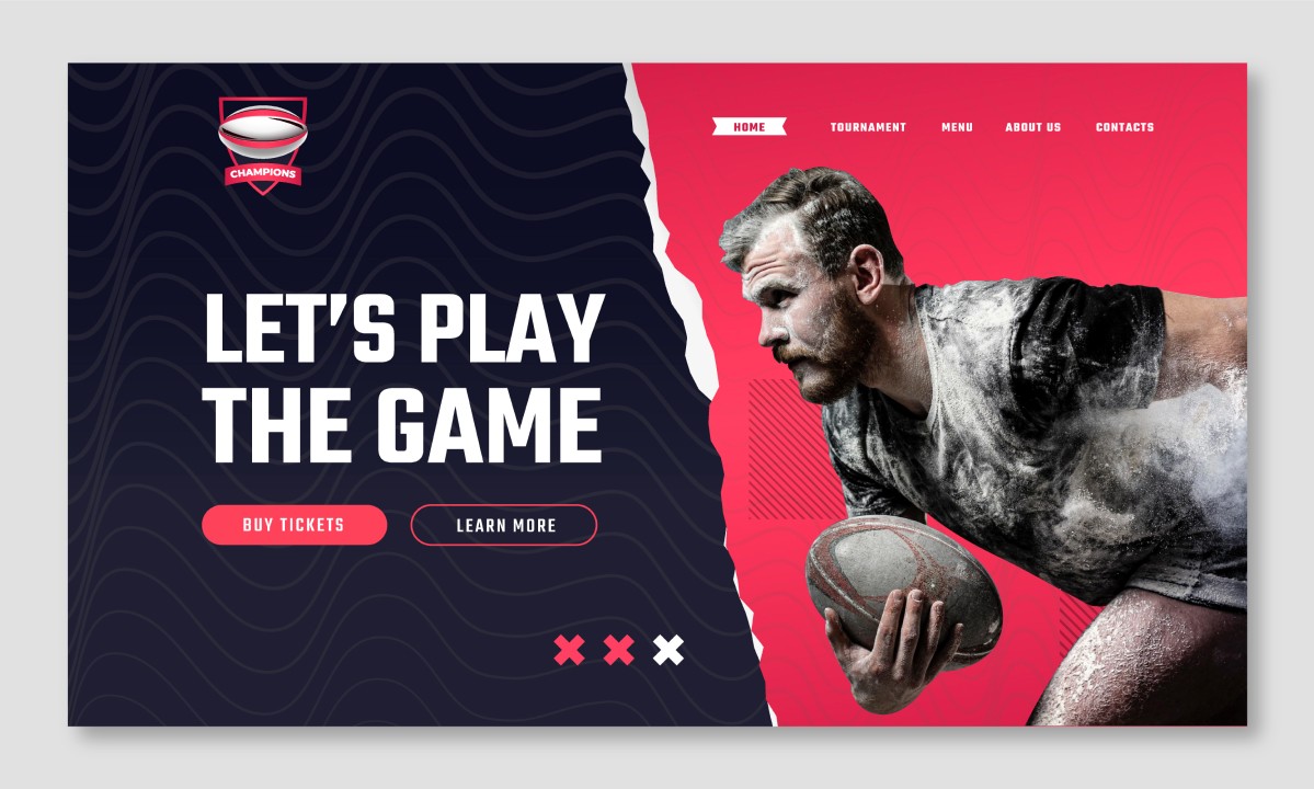
Creative Landing Page Design for a SaaS Product
A Portfolio Case Study
In this portfolio case study, I am excited to showcase my creative landing page design for a SaaS product. The objective of this project was to create a landing page that effectively communicates the benefits and features of the product while also enticing visitors to sign up for a free trial.
To achieve this goal, I started by conducting extensive research on the target audience and the market. Based on my research, I created a user persona and identified the key pain points and needs of the target audience. I then crafted a messaging strategy that directly addressed these pain points and highlighted the unique features of the product.
For the design, I opted for a clean and minimalist approach with a focus on typography and imagery. The color palette was carefully selected to create a sense of trust and reliability, while the use of white space helped to keep the design uncluttered and easy to navigate. I also incorporated clear calls-to-action throughout the page to encourage visitors to sign up for the free trial.
Overall, I am proud of the result of this project and believe that the landing page design effectively communicates the value of the product to the target audience.
Landing Page
March 2023
Websites